

The IDI Branding

Pfizer – IBRANCE MOA Video
A metastatic breast cancer (mBC) diagnosis is a lot to take in. This mode of action (MOA) video was developed for Pfizer to help those with mBC better understand their diagnosis and learn how treatment with IBRANCE (palbociclib) can improve the remainder of their lives.

Pfizer – IBRANCE Social

Good Cleansing
Good Cleansing is a company with a long history of having a healthy obsession for clean and delicious juice. Packing 25 years of passion into an identity was certainly a challenge, but overall the design and aesthetic that was developed made a huge wave on the internet. At the time they were one of the largest internet-based juice cleansing companies.

GLTC Wallpaper Murals
In preparation for the grand opening of Greater Lynchburg Transit Company’s new operations and maintenance facility, I was asked to design original works of art to be displayed on six walls throughout the building. I wanted to showcase the rich history that GLTC had in Lynchburg. Being a brand new facility, I didn’t want GLTC’s rich past to be forgotten. So, I was given access to their vast library of newspaper articles, tickets, schematics, etc. The murals became collages that show layers of historic material.

Verizon – Device Emulators
While working at Ozmo (formerly Modea), I was part of a group of teams developing interactive mobile device tutorials
and simulations for the web across multiple platforms using photo editing software, screen capturing technology, digital production photography, and XML coding. These tools and products allow customers and call center representatives for telecom companies to easily and swiftly resolve their mobile device questions. The devices shown were photographed and edited by me and can be seen on Verizon's website.
check it out online!
http://www.verizonwireless.com/support/iphone-6/simulator/

Petcube Ad Campaign
Petcube is an interesting spin on traditional home monitoring systems, the focus being pets. This new technology wasn’t a product for every pet owner, it was a product for pet owners that are truly obsessed with their furry friends. The product itself is inherently adorable, allowing you to see, hear, and speak to you pet and also operate a laser pointer via mobile device. Each feature deserved its own spotlight so I broke up the ad campaign into three distinct ads to bring more attention to each.

Telus – Emulators
While working at Ozmo (formerly Modea), I was part of a group of teams developing mobile device tutorials
and simulations for the web across multiple platforms using photo editing software, screen capturing technology, digital production photography, and XML coding. These tools and products allow customers and call center representatives for telecom companies to easily and swiftly resolve their mobile device questions. The devices shown were photographed and edited by me and can be seen on Telus’ website along with a majority of the icons designed to aid in the navigation of the simulators.
check it out online!
http://www.telus.com/en/bc/get-help/mobility/devices/windows/nokia-lumia-635/support.do
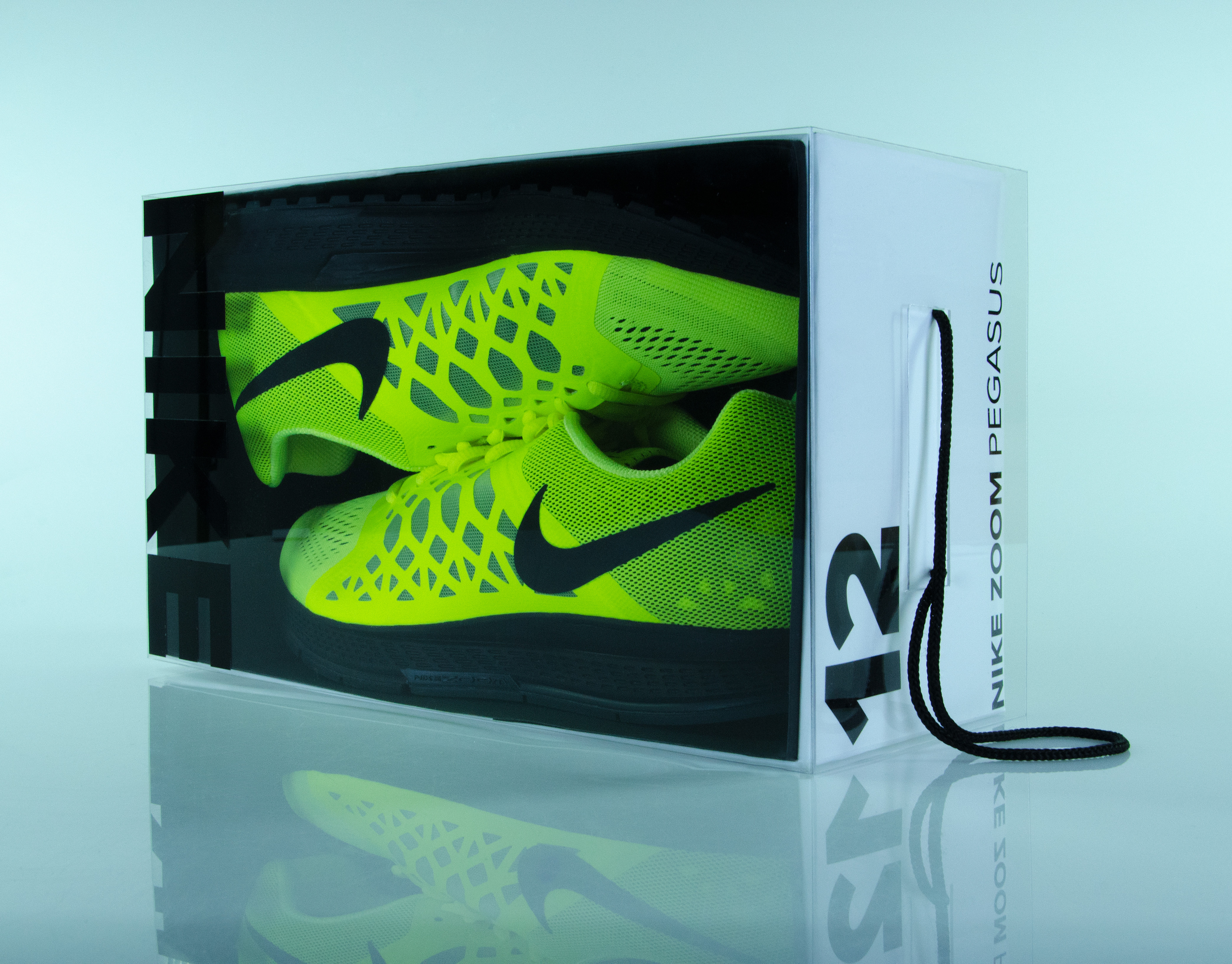
NIKE Shoe Box Concept
This was an attempt to challenge the legacy design and function of shoeboxes. The biggest difference is the use of materials to construct the box in order to better showcase the shoes. Subtle additions like the cord handle eliminate the need for a bag and the transparent cover acts as a window allowing others to view the new shoes in an almost framed-art manner. The use of Nike shoes was to add a stronger sense of realism to the new box design and show how a real shoe would be displayed.

Smoothie Fresh Café
I was given the special opportunity to help a start-up business develop a brand from the ground up that complimented its vision for truly healthy food at affordable prices. Just like the nature of their products, I wanted their image to be simple, clean, and honest.

Burn After Reading
My personal brand utilizes a clandestine mood to create mystery and increase interest. This was ultimately intended to be mailed out to potential clients and employers. The concept was to bring attention to my talents in the form of a secret mission file. Included was my business card in the form of an access card to some unknown restricted area. Info about myself was presented as a dossier with details about my last known location, body type, and mugshot. Also included was a document with instructions to contact me and view my portfolio as if they were nuclear launch codes. The last piece is a 'mission complete' leave-behind that I would give once I made contact thanking them for their service.

EXO Ionic Water
This was a product concept that would be marketed toward those who are active and health conscious. The name alludes to an “EXO-tic” source of energy that is not of this world. Aluminum gave it an aerospace look and feel. The packaging compounded the other worldly aesthetic with its completely unique approach to the way it utilizes the shape of the bottles to securely hold them together.

Personal First Aid Kits
This was a packaging design project that resulted in challenging the design of first aid kits. Through much research I discovered how moderately confusing it is to find and use the correct medical products to treat injuries. This gave rise to the idea of developing smaller, specialized kits for some of the most common injuries such as cuts, burns, bites, and pain. The colors were carefully selected to act as a visual aid to inform the user what the kit is intended to be used for.

Neue Typographic Fiction
In collaboration with three other designers, we were asked to make a multitude of thumbnail sized images using dry transfer lettering. After choosing a handful of our favorite compositions we increased the scale of the thumbnails to 5” X 7.375” and made 16 cohesive spreads. These spreads lent way to five short chapters of visually similar and suggestive images expressing how type can be used for purposes other than the assimilation of knowledge through reading. These 16 spreads are a typographic fiction that the viewer is allowed to create using their own imagination and thought. Our final outcome was a two-color entirely screen printed book with a laser cut and etched cover.
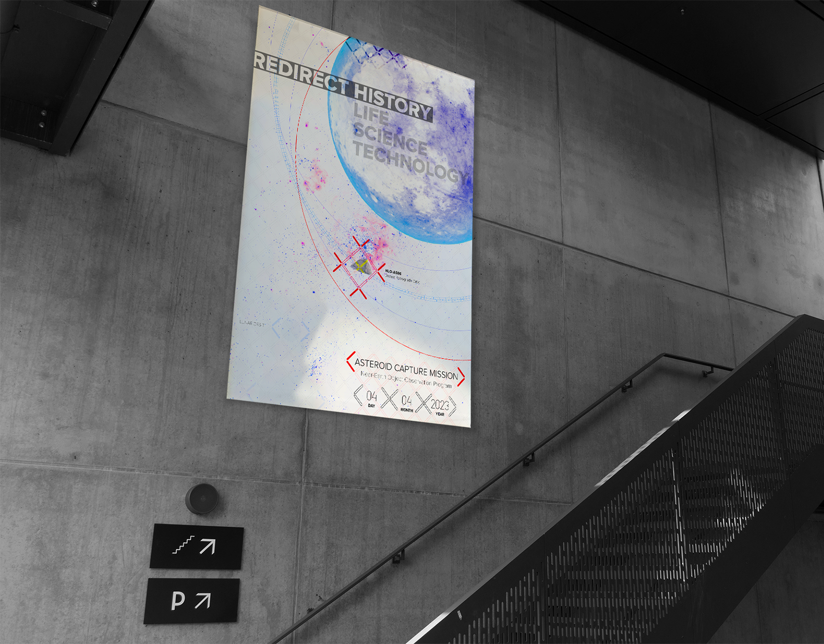
NASA Asteroid Capture Poster
This is a poster I made for a near-future NASA mission/program that aims to capture an asteroid and redirect it into lunar orbit to prove as a testing ground for a manned mission to Mars. The poster helps to simplify this endeavor by visually depicting the paths the asteroid might take when approaching lunar orbit. One of these paths shows the slim chance of an impact resulting in catastrophic mission failure. The photograph of the moon was taken by me and contains many smaller images of the moon’s surface through the use of a high-powered telescope connected to my digital camera.

Explore Poster / Book Cover
This was a project that started as a custom type experiment but lended its way as a means to express an outlook I have on life. It was also an exploration into vector illustration that taught me a few things about color, scale, and maintaining a cohesive look when stylizing objects that are usually very complex naturally.

Just My Type Cover Design
This was a redesign of a cover for a book I enjoy immensely. The title was custom made type that I partially cut out using a laser cutter in order to fold up a few portions of each letter. I did this because I wanted the viewer to fill in the blanks in hopes that it would make them use their own imagination to finish the appearance of each letter. This was my attempt of adding another layer of cleverness to the title of the book by allowing the viewer to imagine their own “type.”

AIGA T-Shirt Design
Recently, the School of Visual Arts at Virginia Tech has started its own AIGA chapter. In response to this, I created a variation of the AIGA logo to make it more appealing to wear on a shirt. The appearance of the logo is rounded and derived from circles. The folding of the letterforms not only gives each one dimensionality, but also alludes to the physical craft of designing something through folding, cutting, etc.